In the fast-paced world of online retail, your product page design can make or break your sales. If your pages aren’t converting browsers into buyers, it’s time for an upgrade. This guide dives into seven proven tactics that can transform your product pages from wallflowers to conversion magnets.
Whether you’re selling artisanal cheese or cutting-edge gadgets, these e-commerce product page design strategies will help you create pages that don’t just showcase your products – they sell them. Ready to turn those window-shoppers into happy customers? Let’s jump in and give your product pages the makeover they deserve.
Quick Wins for Busy Online Retailers
- Stunning product images sell themselves
- Write descriptions that speak to your customers’ needs
- Make buying a no-brainer with clear pricing and bold CTAs
- Build trust to turn browsers into buyers
- If it’s not mobile-friendly, it’s not customer-friendly
- Let data guide your decisions with A/B testing
- Stand out with features your competitors don’t have
Why Your Product Pages Might Be Costing You Sales
You’ve poured your heart and soul into creating an amazing product. It’s innovative, it’s stylish, and it solves problems your customers didn’t even know they had. But for some reason, your product pages are about as popular as a vegetarian at a BBQ contest.
Here’s the cold, hard truth: Your product pages might be letting you down. In today’s cutthroat eCommerce world, where nearly 70% of shopping carts are abandoned, “good enough” just doesn’t cut it anymore.
But don’t worry – we’ve got your back. We’re about to walk you through seven tactics that will transform your ho-hum product pages into conversion machines. By the time we’re done, your pages will be so irresistible, you might need to warn customers with weak willpower before they visit your site.
Ready to give your product pages a makeover that would make even the most dramatic reality show hosts jealous? Let’s jump in!
1. Create a Product Image Gallery That Sells
Why Great Product Images Matter
In the world of online shopping, your product images are doing the heavy lifting. They’re not just showing off your product – they’re telling its story, creating desire, and yes, making your potential customers reach for their wallets.
What Makes a Killer Product Image Gallery?
- A showstopping hero shot: This is your product’s time to shine. Make it count with an image so clear and appealing, customers will feel like they can reach out and touch it.
- Zoom that means business: Let your customers get up close and personal. We’re talking “count the stitches in that leather” or “read the fine print on that label” level of detail.
- All angles covered: Show your product from every angle that matters. Front, back, side, top, bottom – leave no stone unturned.
- Lifestyle shots that inspire: Show your product in action. If you’re selling a coffee maker, show it in a cozy kitchen with a steaming mug nearby.
- Real people, real love: Nothing sells like seeing real customers using and loving your product. It’s social proof in picture form.
The Surprising Impact of Image Size
Here’s something that might raise your eyebrows: Etsy found that bigger images led to 18.75% more sales. Turns out, size does matter – at least when it comes to product photos.
Playing Devil’s Advocate: Can You Have Too Many Images?
While it’s tempting to show off your product from every possible angle, there’s a point where more isn’t better. Too many images can slow down your page, and we all know that a slow site is the fastest way to lose customers. Aim for 3-7 high-quality images that tell your product’s full story.
Your 5-Minute Image Upgrade
Take a quick look at your best-selling product page right now. Count the images and rate their quality. Do they show everything a customer needs to see? Is there a clear hero shot? If not, make a plan to improve your images this week.
2. Write Product Descriptions That Make Wallets Open
The Power of Words in eCommerce
Your product description is where you seal the deal. It’s your chance to convince customers that they absolutely need what you’re selling – and they need it now.
How to Write Descriptions That Sell
- Focus on benefits, not just features: Don’t just list what your product does. Tell customers how it will make their lives better. “This isn’t just a toaster – it’s your ticket to stress-free mornings and perfectly crispy bread, every single time.”
- Make it easy on the eyes: Use short paragraphs, bullet points, and plenty of white space. Remember, online shoppers skim before they read.
- Paint a picture with words: Use language that engages all five senses. “The buttery soft leather feels like a warm hug for your feet, while the subtle scent of high-quality hide fills the air.”
- Highlight what makes you special: What sets your product apart from the competition? If you can’t answer this, it’s time to go back to the drawing board.
- Let your customers do the talking: Sprinkle in some real customer testimonials. Nothing sells quite like a glowing review from someone who’s already loving your product.
A Bold Move: Telling Customers Who Shouldn’t Buy
Here’s an idea that might sound crazy at first: What if you included a “This product isn’t for you if…” section in your description? It sounds counterintuitive, but hear me out. By being upfront about who your product might not suit, you build trust with your ideal customers and potentially reduce returns. It’s a gutsy move, but in a world where everyone’s always selling, honesty can set you apart.
The Great Debate: Short and Sweet vs. Long and Detailed
Common wisdom says to keep things brief in our short-attention-span world. But what if that’s not always right? Some brands have found success with longer, story-driven descriptions. The key is to make every word count and structure your copy so it’s easy to scan.
Your 5-Minute Description Boost
Take a moment to list all the benefits of your top-selling product. Now, challenge yourself to rewrite the first sentence of your product description, focusing on the most compelling benefit. Bonus points if you can make it intriguing enough that customers can’t help but read more.
3. Nail Your Pricing and Call-to-Action
The Psychology Behind Pricing and CTAs
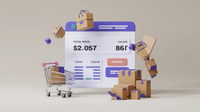
Pricing isn’t just about numbers – it’s about perception, value, and sometimes, a little bit of magic. Your pricing strategy and call-to-action (CTA) are the final push that turns “just browsing” into “shut up and take my money.”
Elements of Irresistible Pricing and CTAs
- Crystal clear pricing: No hidden fees or nasty surprises. Be as transparent as a freshly cleaned window.
- Quantity options that make sense: Make it easy for customers to buy more. Because sometimes one awesome thing just isn’t enough.
- A “Buy Now” button that demands attention: Make it stand out like a peacock at a penguin party. Think bold, think unmissable.
- Wishlist option for the hesitant: For those who aren’t ready to commit… yet.
- Create a sense of urgency: Limited time offers, low stock warnings, or countdown timers can give that extra push to buy now rather than later.
The Truth About Button Colors (It’s Not What You Think)
Brace yourself, because this might surprise you: There’s no universally “best” button color for conversions. What really matters is contrast and context. Your CTA should pop off the page like it’s in 3D.
Rethinking Traditional Pricing
In a world of dynamic pricing and personalized offers, is the old fixed pricing model becoming a relic? Some brands are experimenting with “pay what you want” models or subscription-based pricing for products. While it’s not for everyone, it might be worth considering if a more flexible approach could work for your brand.
Your 5-Minute CTA Checkup
Take a quick look at your CTAs across your top 5 product pages. Are they consistent? Do they stand out? Are they using action-oriented language? If not, plan to update them this week. Remember, your CTA is your closer – make it work hard for you!
4. Build Trust Signals That Actually Work
Creating Digital Trust in a Skeptical World
In the vast ocean of the internet, trust is as precious as buried treasure. Your trust signals are like your digital handshake – they reassure customers that you’re the real deal, not some fly-by-night operation.
Must-Have Trust Builders for eCommerce
- Security badges that mean business: Show off those SSL certificates. They’re like a digital bouncer for your site.
- A money-back guarantee with teeth: Nothing says “I stand behind my product” like a no-questions-asked refund policy.
- Free shipping (with a twist): “Free” is everyone’s favorite price. Use it wisely to encourage larger purchases.
- Customer support that’s actually supportive: Make it easy for customers to reach you. Bonus points if you’re available 24/7 (but we get it if you need to sleep sometimes).
- Social proof that’s actually proof: Let customers check out your social media. It’s like inviting them to peek behind the curtain of your business.
The Paradox of Trust: Less is More
Here’s something that might blow your mind: More trust signals don’t always equal more trust. In fact, too many badges and guarantees can actually make you seem less trustworthy. The key is to choose a few powerful, relevant trust signals rather than plastering your page with every seal and badge you can find.
Are Reviews Always Golden?
We’ve all been taught that customer reviews are eCommerce gold. But what if they’re not always helping? A study found that 83% of shoppers specifically look for negative reviews. Consider showcasing how you’ve addressed negative feedback to turn potential objections into trust-building opportunities.
Your 5-Minute Trust Boost
Put yourself in your customer’s shoes for a moment. Visit your site as if for the first time. What makes you trust (or distrust) the site? List three trust-building elements you could add or improve this week.
5. Make Mobile Your Priority, Not an Afterthought
The Mobile Shopping Revolution is Here
Wake up and smell the smartphones: It’s 2024, and if your product pages aren’t mobile-friendly, you might as well be selling via carrier pigeon. With mobile commerce sales set to hit $3.9 trillion this year, mobile isn’t just important – it’s everything.
Must-Haves for Mobile-Friendly Product Pages
- Responsive design that actually responds: Your page should look good on everything from a smartwatch to a tablet.
- Buttons big enough for human fingers: No one should need the precision of a surgeon to tap your “Add to Cart” button.
- Speed that would make Usain Bolt jealous: If your page loads slower than a sloth on vacation, you’re losing customers faster than you can say “bounce rate.”
- Navigation that doesn’t need a map: On mobile, simpler is better. Streamline your menu like you’re decluttering your closet.
- Checkout process smoother than a fresh jar of Skippy: Make buying on mobile so easy, customers could do it while walking the dog (but please, watch where you’re going).
Flipping the Script on Mobile Design
Here’s a wild idea: What if you designed for mobile first, then adapted for desktop? This “mobile-first” approach forces you to focus on what’s essential and can lead to cleaner, more user-friendly designs across all devices.
The App-Only Debate
Some brands are going all-in on app-only experiences, ditching mobile websites entirely. While this can lead to more engaged customers and higher average order values, it also limits your reach. Think hard about your target audience and product type before jumping on this bandwagon.
Your 5-Minute Mobile Checkup
Take a moment to run your top product page through Google’s Mobile-Friendly Test. How’d you do? If you’re not in the green, tackle the biggest issue this week. Remember, every second of load time counts in the mobile world!
6. Embrace A/B Testing (Your New Secret Weapon)
The Scientific Method Meets eCommerce
Think you’ve created the perfect product page? Think again, hotshot. The only way to know for sure is to test, test, and test some more. Welcome to A/B testing, where data is king and assumptions go to die.
What to Test on Your Product Pages
- Headlines that hook: Test different product names or taglines. Maybe “Widget 3000” isn’t as catchy as “The Doohickey That’ll Change Your Life.”
- Images that wow: Try different hero shots or image sequences. Your product might look better from the left. Or upside down. You won’t know until you test.
- CTAs that convert: Play around with button colors, text, and placement. Moving that “Buy Now” button could be like finding the G-spot of your page layout.
- Prices that feel right: Experiment with different price points or discount structures. Sometimes $20 with free shipping beats $19.99.
- Layouts that flow: Try different arrangements of elements. It’s like playing Tetris, but the prize is more sales.
The Shocking Truth About A/B Testing
Here’s a stat that might make you spit out your coffee: Only 17% of marketers use A/B testing strategies. That means 83% of your competitors are basically guessing. If you commit to data-driven decisions, you’re already ahead of the game.
Can You Test Too Much?
While A/B testing is powerful, it’s possible to get stuck in analysis paralysis. Not all tests will yield earth-shattering results, and some changes might have unintended consequences. Always consider the bigger picture of user experience and brand consistency when implementing test results.
Your 5-Minute A/B Test Starter
Set up a quick A/B test on your top product page right now. It could be as simple as changing the color of your “Add to Cart” button. Use a tool like Google Optimize to get started. Remember, even small changes can lead to big results over time!
7. Add Bonus Features That Make You Unforgettable
Standing Out in a Sea of Sameness
In a world where every eCommerce store starts to blur together, it’s the little extras that can make you memorable. These bonus features are like the sprinkles on your product page sundae – not essential, but oh so delicious.
Game-Changing Extras for Your Product Pages
- 360-degree views that dazzle: Let customers spin your product around like they’re DJs at a rave.
- Augmented reality that wows: Perfect for fashion or home decor. Let customers see how your products look in their world before they buy.
- Video demos that sell: Show off your product in action. It’s like an infomercial, but actually watchable.
- Q&A sections that engage: Let your community answer questions. It’s like crowdsourcing customer service!
- Smart recommendations: Suggest complementary items. Because if they’re buying a hammer, they might need some nails too, right?
The Double-Edged Sword of Fancy Features
Here’s some food for thought: While advanced features can set you apart, they can also slow down your site and complicate the user experience. The key is to choose features that actually enhance the shopping experience for your specific products and customers.
Are Cutting-Edge Features Always Better?
It’s tempting to jump on every new eCommerce tech trend, but sometimes the basics done well can outperform flashy new features. Before investing in the latest AR tool or AI-powered recommendation engine, make sure you’ve nailed the fundamentals of product page design.
Your 5-Minute Feature Brainstorm
Take a moment to think of three unique features you could add to your product pages that would genuinely improve the customer experience. Then, pick one and start researching how to implement it. Remember, the goal is to stand out in a way that adds value, not just novelty!
Your Product Page Makeover Action Plan
Congrats, eCommerce champion! You’ve just speed-run through a masterclass in product page design. But knowledge without action is about as useful as a chocolate teapot, so here’s your homework:
- Audit your product images this week. Are they selling your product short?
- Rewrite one product description focusing on benefits, not just features.
- Check your CTAs – are they impossible to ignore?
- Add one new trust-building element to your page.
- Run a mobile-friendly test and fix the biggest issue.
- Start one A/B test, no matter how small.
- Brainstorm one unique feature you could add to your pages.
Remember, the perfect product page isn’t built in a day. But with these tactics in your toolkit, you’re well on your way to creating pages that don’t just showcase your products – they sell them.
Now go forth and conquer the digital marketplace, you brilliant entrepreneur, you! And if anyone asks where you got these game-changing tips, just tell them a caffeine-fueled eCommerce nerd at Bizlegos couldn’t sleep until they shared their secrets with the world. (That’s us, in case you were wondering. You’re welcome.)
Stay tuned for our next post, where we’ll be diving into “The Art of Product Photography: Making Your Widgets Look Like Masterpieces.” It’s going to be picture perfect, pun absolutely intended!


