Is your e-commerce landing page more of a bounce house than a conversion machine? You’re not alone. The average landing page conversion rate across industries is just 2.35%. But top-performing pages are converting at 11.45% or higher. What’s their secret sauce?
In this guide, we’ll walk through 10 proven strategies to transform your landing pages from “meh” to “cha-ching!” Whether you’re launching a new product or trying to breathe life into a stagnant page, these tips will help you create landing pages that convert like crazy.
TL;DR for the Busy E-commerce Entrepreneur
- Keep it simple with a clean, minimal design
- Craft compelling headlines and copy focused on benefits
- Use high-quality visuals that showcase your products
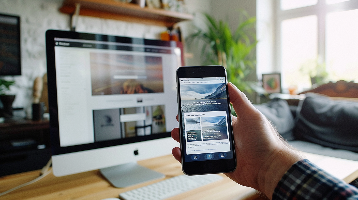
- Optimize for mobile users with responsive design
- Improve page speed for lightning-fast load times
- Create clear, action-oriented CTAs
- Build trust with social proof and security elements
- Streamline forms for easy completion
- Personalize the user experience
- Continuously A/B test to improve performance
1. Embrace Minimalism: Less Clutter, More Conversions
Picture this: A customer lands on your page and is immediately bombarded with flashing banners, popups, and a navigation menu with 47 options. Overwhelmed, they hit the back button faster than you can say “abandoned cart.”
The solution? Embrace minimalism. A clean, uncluttered design helps visitors focus on what matters – your offer. Here’s how to declutter:
- Remove unnecessary navigation links
- Limit your color palette to 2-3 complementary colors
- Use plenty of white space to let your content breathe
- Focus on one primary call-to-action (CTA)
Pro E-commerce Tip: Think of your landing page as a helpful sales associate, not an overeager car salesman. Guide visitors gently towards conversion, don’t shout at them.
Real-world Example: Fashion retailer Everlane saw a 36% increase in conversions after simplifying their product pages, removing distractions, and focusing on high-quality imagery.
Quick Action Step: Audit your current landing page. Identify and remove at least three elements that don’t directly contribute to your conversion goal.
2. Craft Compelling Headlines and Copy: Words that Sell
Your headline is the first impression visitors get – make it count! A great headline should:
- Clearly communicate your unique value proposition
- Address a specific pain point or desire
- Create a sense of urgency or curiosity
For example, instead of “New Running Shoes,” try “Run Faster, Longer, and Pain-Free with RevolutionX Shoes – 30-Day Risk-Free Trial!”
When it comes to body copy:
- Focus on benefits, not just features
- Use short paragraphs and bullet points for easy scanning
- Incorporate social proof (testimonials, reviews, case studies)
- Address potential objections head-on
Remember, you’re not writing a novel. Keep it concise and compelling.
Common Online Store Mistake Alert: Avoid using generic product descriptions. Craft unique, benefit-focused copy that speaks directly to your target audience’s needs and desires.
E-commerce Strategy: Use the PAS (Problem-Agitate-Solution) formula in your copy. Start by identifying the problem your customer faces, agitate it by emphasizing the pain points, then present your product as the perfect solution.
Quick Action Step: Rewrite your main headline using the formula: [Desired Outcome] + [Timeframe] + [Address Objection]. For example: “Double Your Sales in 30 Days – No Tech Skills Required!”
3. Leverage High-Quality Visuals: A Feast for the Eyes
In e-commerce, seeing is believing (and buying). High-quality product images and videos can make or break your conversion rates. Consider these visual strategies:
- Use multiple angles and zoom capabilities for product images
- Incorporate lifestyle shots showing your product in use
- Create short demo videos showcasing key features
- Add 360-degree views for complex products
Industry Insight: According to a study by Etsy, adding video to product listings increased the likelihood of a sale by 30%.
What If? Your product images could talk? Make sure they’re telling a compelling story about how your product fits into your customer’s life.
Quick Action Step: Identify your top-selling product and create a 30-second demo video highlighting its key features and benefits.
4. Optimize for Mobile Users: Thumb-Friendly Shopping
With mobile e-commerce sales projected to hit $3.56 trillion in 2021, your landing pages need to shine on small screens. Mobile optimization tips:
- Use a responsive design that adapts to different screen sizes
- Ensure buttons and form fields are large enough to tap easily
- Minimize text input required on mobile forms
- Test your page across multiple devices and browsers
E-commerce Strategy: Consider implementing “thumb-friendly” navigation for mobile users, placing important elements within easy reach of the thumb when holding a smartphone.
Real-world Example: When Walmart optimized their mobile site, they saw a 98% increase in mobile orders.
Quick Action Step: Use Google’s Mobile-Friendly Test tool to check your landing page and implement at least one suggested improvement.
5. Speed Up Your Page Load Time: The Need for Speed
In e-commerce, every second counts. A 1-second delay in page load time can lead to a 7% reduction in conversions. Yikes! Here’s how to put your landing page on the fast track:
- Compress and optimize images
- Minify CSS, JavaScript, and HTML
- Leverage browser caching
- Use a content delivery network (CDN)
Pro E-commerce Tip: Google’s PageSpeed Insights tool can help identify specific areas for improvement on your landing pages.
Real-world Example: Walmart found that for every 1-second improvement in page load time, conversions increased by 2%.
Quick Action Step: Run your landing page through PageSpeed Insights and implement at least two suggested optimizations.
6. Use Clear and Compelling CTAs: The Art of the Ask
Your call-to-action (CTA) is where the magic happens. Make it impossible to ignore with these tips:
- Use action-oriented, specific language (e.g., “Get My Free Trial” vs. “Submit”)
- Make buttons large and easily clickable, especially on mobile
- Use contrasting colors to make CTAs stand out
- Place your primary CTA above the fold
- Consider using directional cues (arrows, photos of people looking at the CTA)
What If? Your CTA was a person at a party? It should be friendly, clear about its intentions, and impossible to miss – not hiding in the corner mumbling “click me maybe.”
E-commerce Strategy: Try using first-person language in your CTAs. “Start My Free Trial” can outperform “Start Your Free Trial” by creating a sense of ownership.
Quick Action Step: A/B test two different CTA button colors on your main landing page for a week. Use a tool like Google Optimize to track which performs better.
7. Build Trust with Social Proof: Safety in Numbers
Humans are social creatures. We look to others to validate our decisions, especially when it comes to spending money. Incorporate these trust-building elements:
- Customer testimonials (bonus points for video testimonials)
- Trust badges and security seals
- User-generated content (photos, reviews)
- Media mentions or awards
- Number of customers served or products sold
Pro E-commerce Tip: Specificity builds credibility. “Jane S. increased online sales by 37% using our platform” is more powerful than “Customers love our product!”
Real-world Example: Fitness brand Gymshark heavily leverages user-generated content and influencer partnerships, contributing to their explosive growth to a $1.3 billion valuation.
Quick Action Step: Reach out to three satisfied customers and ask for a specific, results-focused testimonial to add to your landing page.
8. Optimize Your Forms: Smooth Sailing to Conversion
Forms are often the final hurdle between a visitor and a conversion. Make them as frictionless as possible:
- Only ask for essential information
- Use inline form validation to catch errors in real-time
- Break long forms into multiple steps
- Clearly label all fields and use placeholder text
- Offer alternative sign-up methods (e.g., social media login)
Remember, every field you add to a form increases the chance of abandonment. Keep it short and sweet!
E-commerce Strategy: For multi-step forms, use a progress bar to show users how far along they are in the process. This can reduce form abandonment rates.
Industry Insight: A study by Baymard Institute found that 26% of US online shoppers abandoned an order because the checkout process was too long or complicated.
Quick Action Step: Review your current form. Can you remove any non-essential fields? Aim to cut at least one field without losing crucial information.
9. Personalize the Experience: Tailor-Made Conversions
One size doesn’t fit all in e-commerce. Personalization can significantly boost conversions:
- Use geolocation to display relevant shipping info or local offers
- Implement dynamic content based on visitor behavior or source
- Offer product recommendations based on browsing history
- Use retargeting to bring back interested visitors
What If? Your landing page was a chameleon, adapting perfectly to each visitor? That’s the power of personalization.
Real-world Example: Amazon attributes up to 35% of its revenue to its personalized product recommendations.
E-commerce Strategy: Use exit-intent popups with personalized offers based on the visitor’s behavior to reduce bounce rates and increase conversions.
Quick Action Step: Implement a personalized product recommendation section on your landing page based on popular items or visitor browsing history.
10. Always Be Testing: The Path to Perfection
The work of a landing page optimizer is never done. Continuous testing and improvement are key to long-term success. Consider A/B testing these elements:
- Headlines and subheadings
- CTA button color, size, and copy
- Form length and fields
- Page layout and design
- Pricing and offer structure
Remember, what works for one business might not work for yours. Let data guide your decisions.
Industry Insight: According to a study by Econsultancy, companies with a structured approach to conversion rate optimization (CRO) are twice as likely to see a large increase in sales.
Pro E-commerce Tip: Don’t test everything at once. Focus on one major element at a time to clearly identify what’s driving changes in your conversion rate.
Quick Action Step: Set up an A/B test for your main headline using a tool like Google Optimize or Optimizely. Run the test for at least two weeks to gather significant data.
E-commerce Growth Hacker’s Cheat Sheet
- Simplify design to focus attention on your offer
- Craft compelling, benefit-focused copy
- Use high-quality visuals to showcase products
- Optimize for mobile users
- Improve page load speed
- Create clear, action-oriented CTAs
- Build trust with social proof
- Streamline forms for easy completion
- Personalize the user experience
- Continuously test and improve
Imagine your e-commerce store with landing pages that convert visitors into customers like a well-oiled machine. With these strategies in place, you’re well on your way to e-commerce superstardom.
Ready to take your landing page game to the next level? Start by implementing one tip today. Remember, in the world of e-commerce, every conversion counts. Your journey to higher conversion rates and increased revenue begins with that first optimization step.
Don’t leave money on the table – start optimizing your landing pages now and watch your e-commerce business soar!
Want to dive deeper? Download our free “E-commerce Landing Page Optimization Checklist” to ensure you’re covering all the bases for maximum conversions. This comprehensive guide will walk you through each step of creating high-converting landing pages, complete with expert tips and real-world examples.
Stay tuned for our next post, where we’ll dive into advanced strategies for reducing cart abandonment. Because in e-commerce, the journey doesn’t end at the landing page – it’s just the beginning of a beautiful customer relationship.


